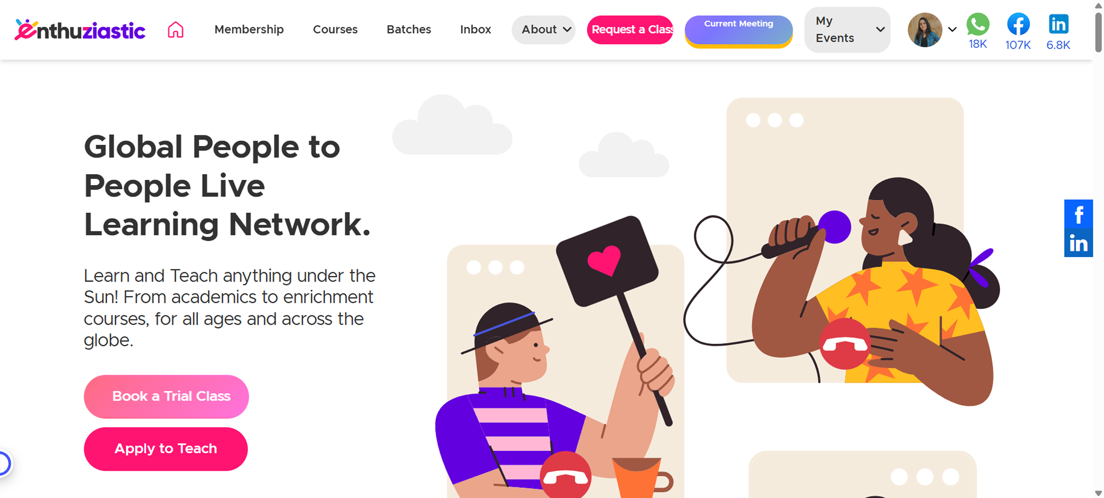
The Problems
The EnthuZiastic homepage had:
- Ineffective hero section that didn’t communicate value clearly
- Mixed messaging that lacked focus for first-time users
- No visual hierarchy for user actions, which led to confusion
- Limited appeal for mobile users
Previous Home Page
The Team
Worked collaboratively with the CEO, developers, marketing, operations, and support team. My role was to drive the research, define layout structure, and craft the visual experience.
The Process
Followed a design thinking approach – empathizing with users, defining the problem, ideating solutions, prototyping, and testing. My goal was to ensure the new homepage aligned both with user behavior and business goals through structured feedback loops and iterations.
Key Steps
1. Stakeholder Interviews
Collaborated with internal stakeholders (CEO, Devs, Ops & Support) to define key goals and understand how most visitors behave.
2. UX Research & Analysis
Reviewed analytics and conducted interviews with parents and tutors to understand expectations. Key insights:
- Most users landed on the home page from social or referral links
- There was poor understanding of the brand’s core mission
- Users felt overwhelmed and left quickly
3. Defining Objectives (UX Goals)
- Clear communication of platform value
- Strong CTA visibility to guide users
- Modern visuals and clear mobile structure
- Remove distractions and define key action flows
4. Design & Iteration
- Developed wireframes and designed a clean, engaging interface that is aligned with brand guidelines. Created interactive prototypes, refining designs based on continuous feedback using Figma.
5. Handoff & Implementation Support
I delivered developer-ready specifications.
Wireframing (Sketching)
User Testing & Iterations
Tested key sections (hero, navigation, CTA visibility) with users and collected feedback via interactive Figma prototypes.
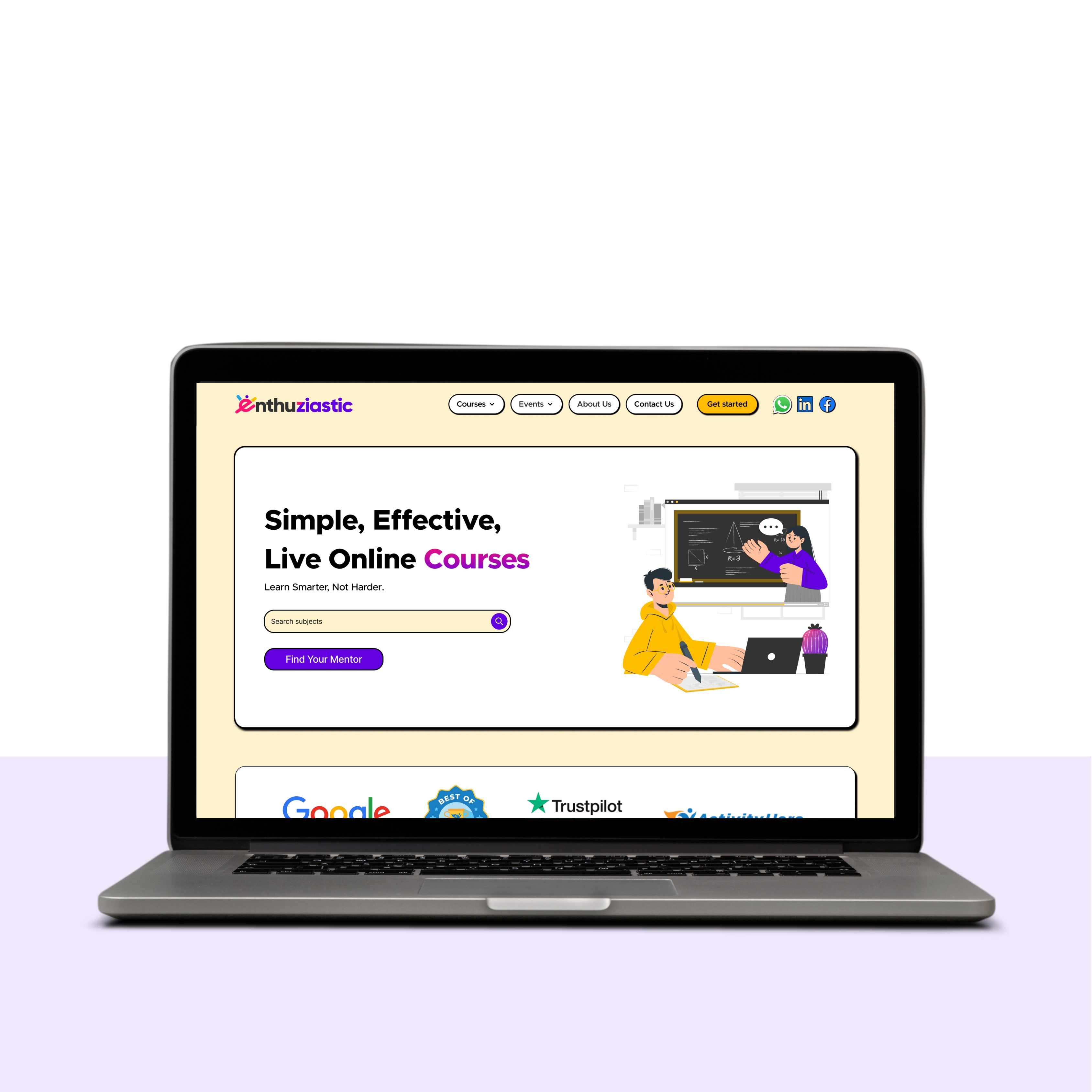
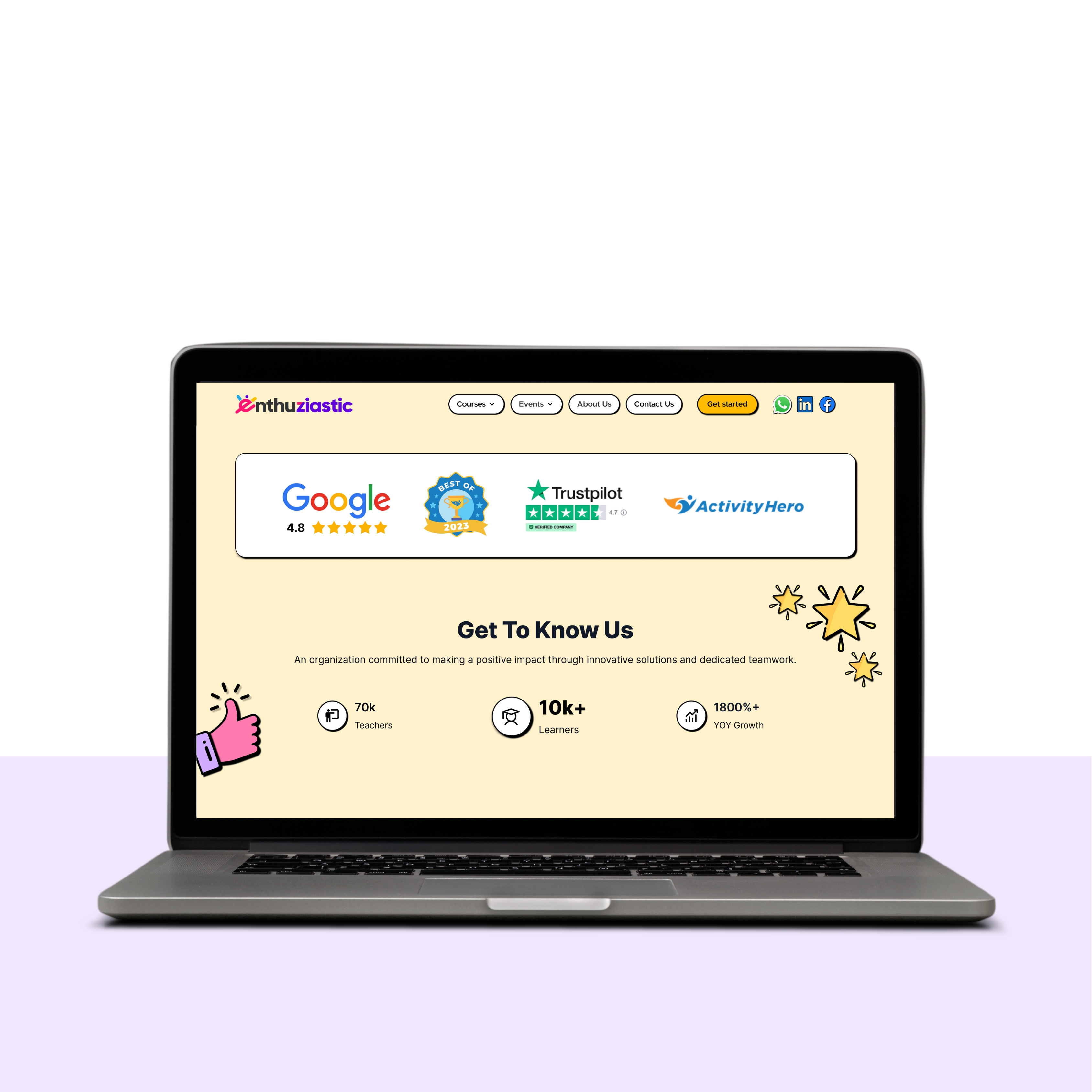
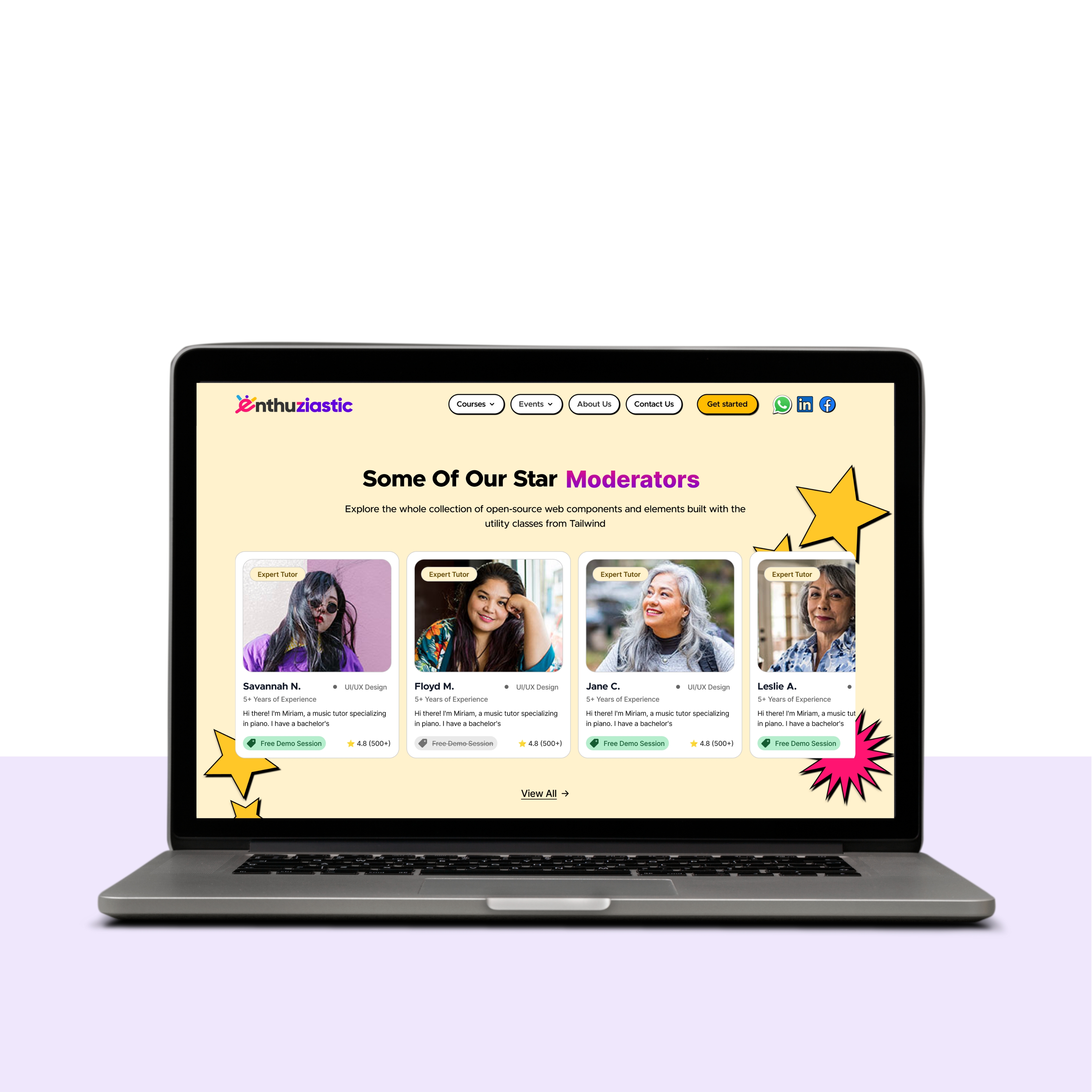
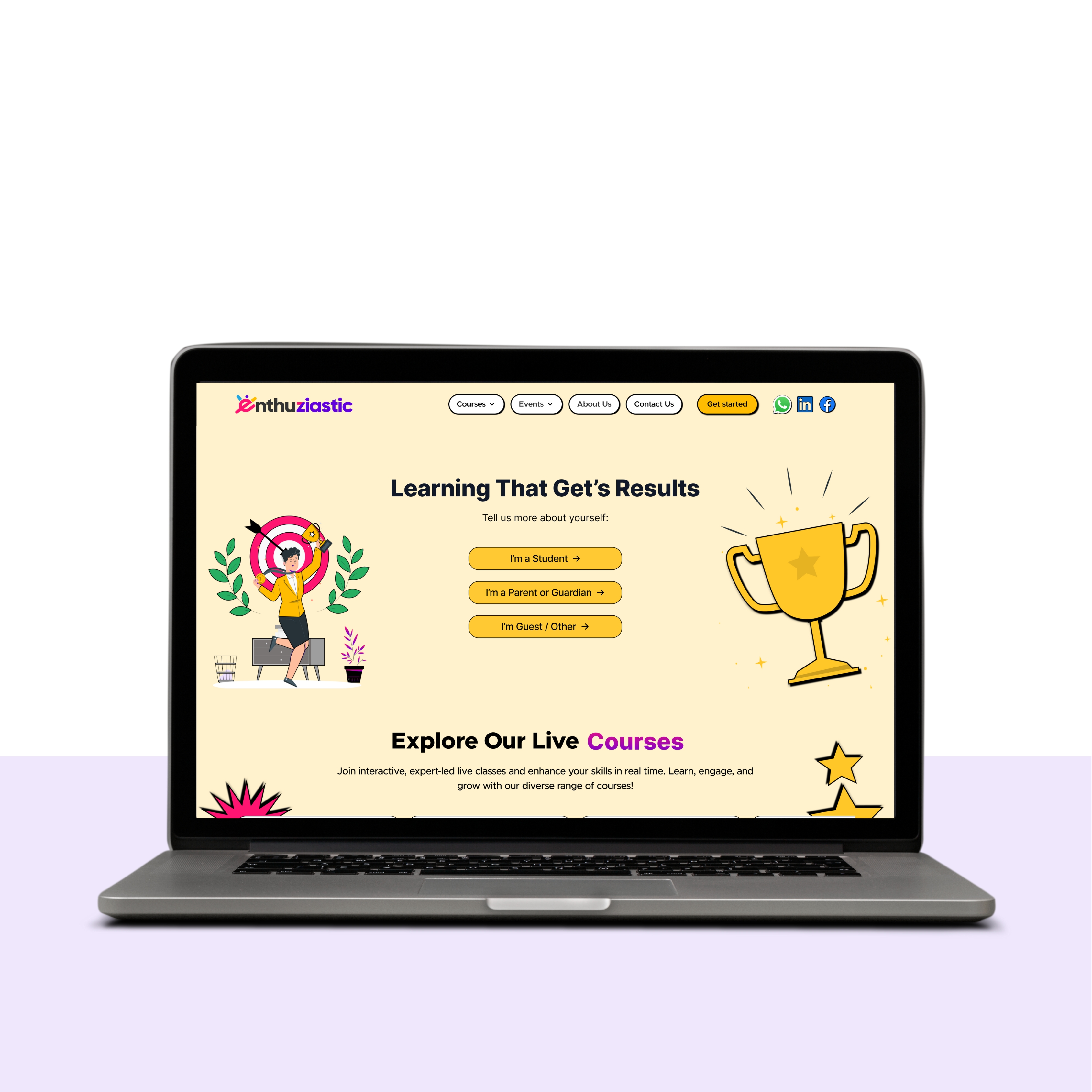
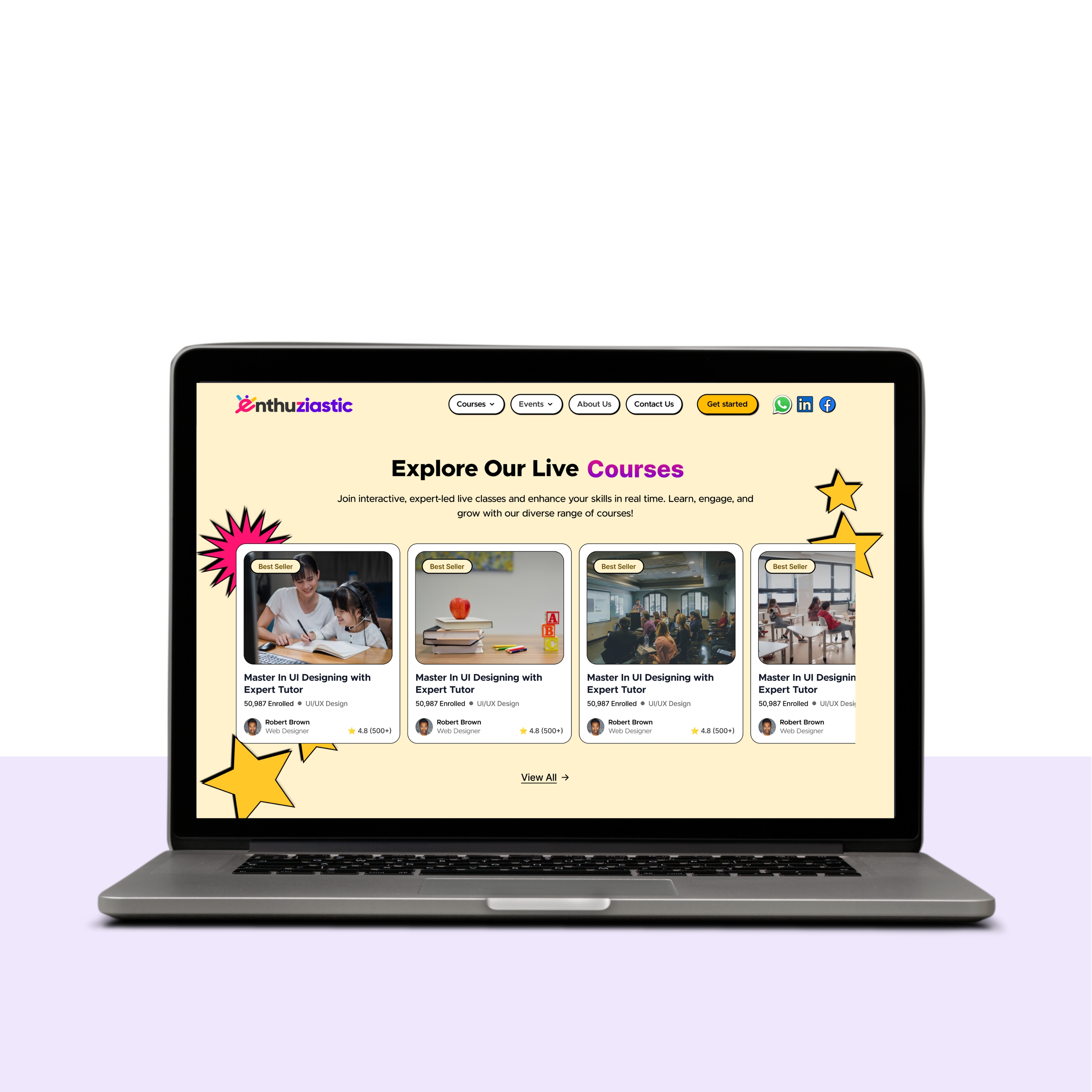
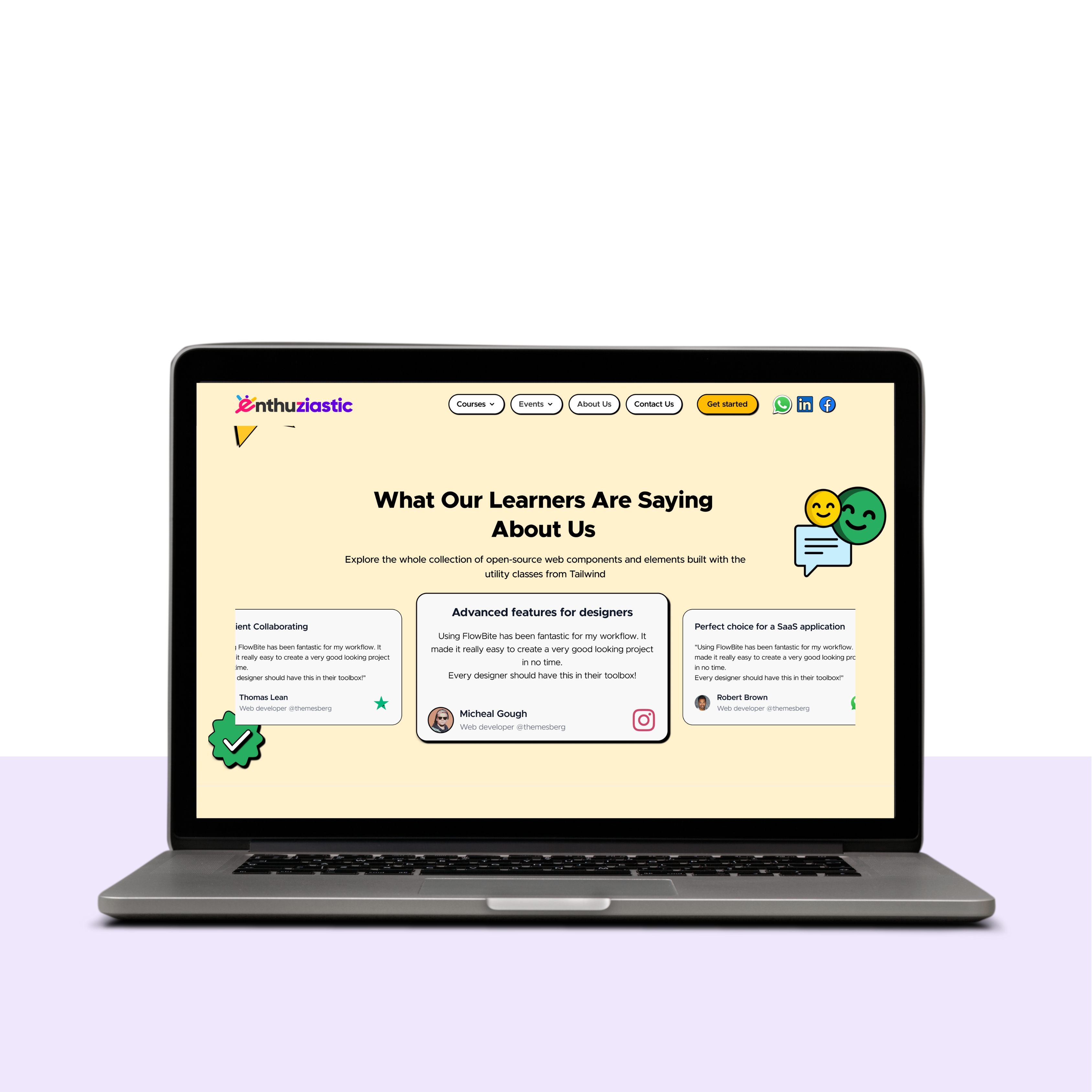
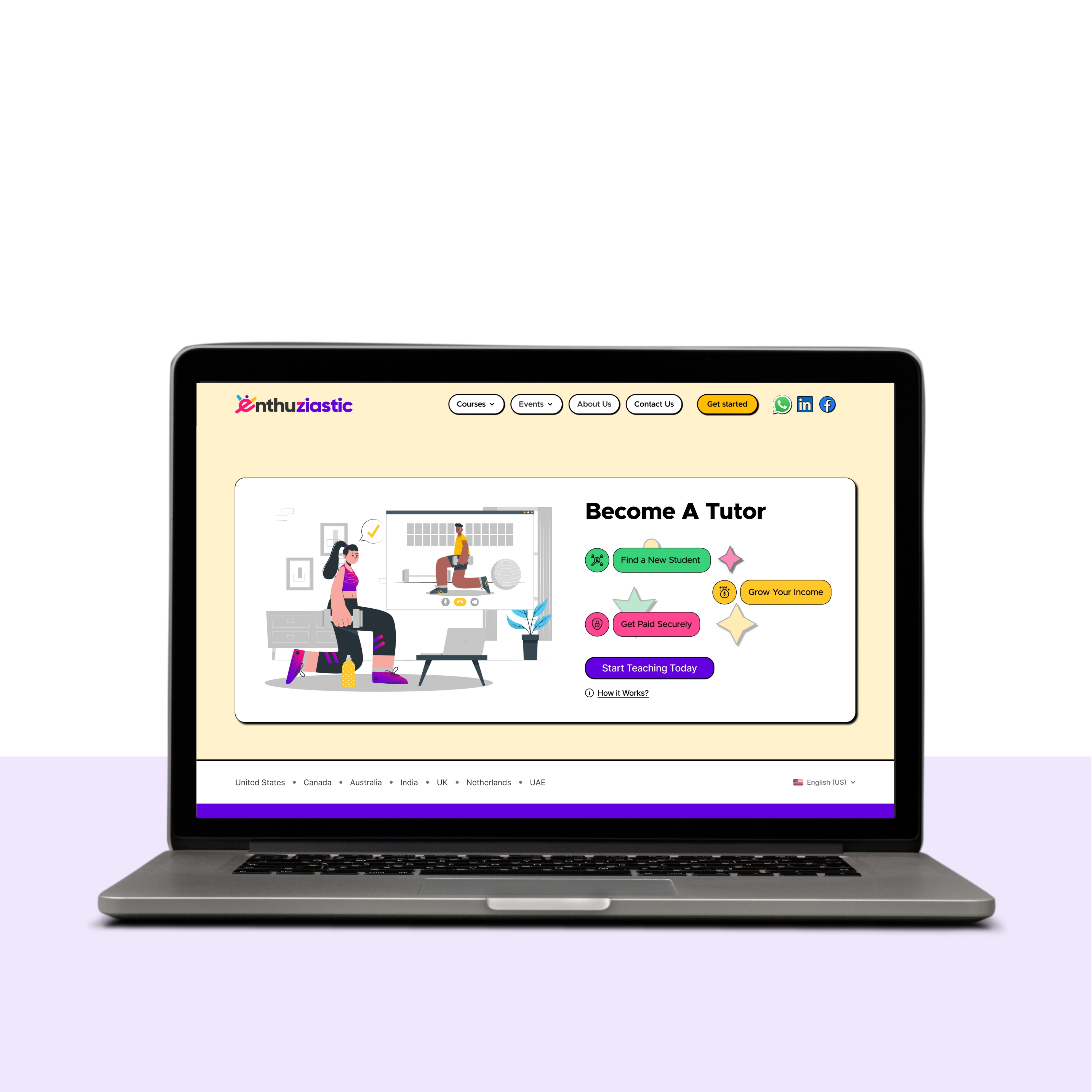
Final Design (New EnthuZiastic Home Page)
Results & Impact
Improved Metrics:
- 📈 60% increase in new visitor interaction rate
- ⏱ Higher Avg. session time
- ✅ Stronger mobile conversion
Lessons Learned
- Consistent voice & visual clarity improves first-time engagement
- Prioritized content (hero, CTA, testimonials) improved performance
- Tiny layout refinements (like CTA spacing) had massive UX impact
Project Gallery