The Problem
Before introducing the Membership UI, EnthuZiastic’s sales team had to manually convince users to purchase individual courses and apply discounts or offers. This process was time-consuming, inconsistent, and heavily dependent on sales bandwidth. It also made it difficult to scale or offer personalized deals. As a result, user experience was fragmented and conversion rates varied significantly.
My Goal Was
- Reduce manual efforts by the sales team.
- Introduce a seamless, transparent self-service model for users.
- Offer tiered value to encourage course engagement and upsell opportunities.
- Increase overall sales and memberships.
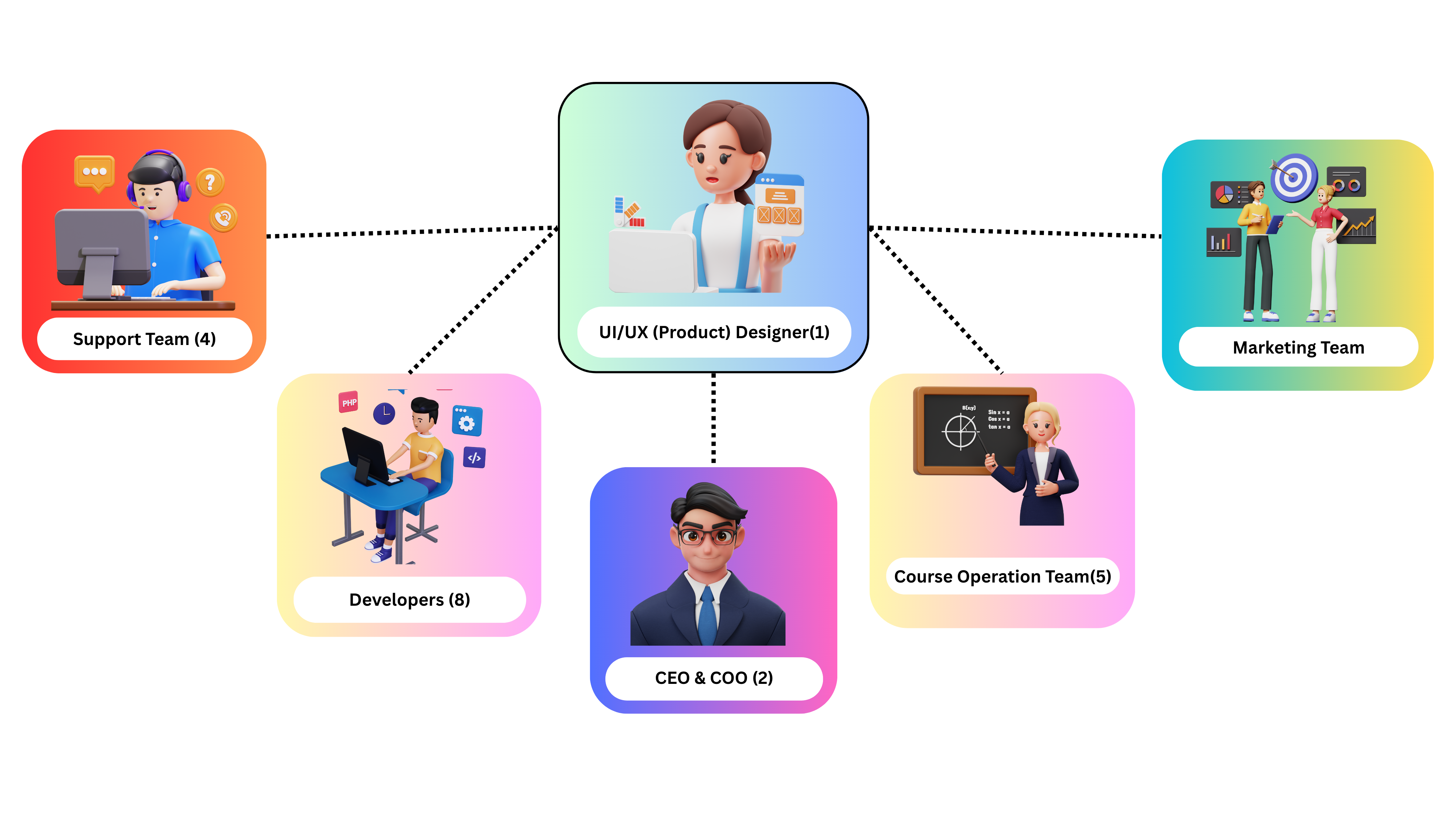
The Team
I led the design solo, collaborating closely with CEO, Developers, Marketing team, Course operation team, and Support team. It was a tight, agile setup that enabled quick iterations and seamless execution.
The Process
I followed a user-centered design thinking process, focusing on understanding users’ pain points and business needs. My goal was to create a solution that balanced usability, business value, and technical feasibility through continuous feedback loops and iteration.
Key Steps
1. Identify Business Pain Points & Sales Friction:
I began by collaborating with the sales, operations, and marketing teams to uncover key challenges in the current system:
- Sales reps were manually explaining plans, applying discounts, and chasing follow-ups.
- There was no centralized place for users to view or purchase bundled offerings.
- Users had inconsistent experiences, leading to confusion and dropped conversions.
2. UX Research:
With internal insights and competitor analysis, I uncovered key user and business needs.
- Users wanted clear pricing and benefits without needing to contact sales.
- Lack of transparency was causing confusion and drop-offs.
- Sales team needed an automated solution to reduce manual follow-ups.
- Competitor models showed that tiered plans and trust signals improved conversions.
3. Defining UX Goals (Set Clear Objective):
- Build trust through transparent pricing, benefits, and purchase.
- Minimize user friction by reducing clicks and decision fatigue.
- Design for responsiveness across all devices.
- Encourage upgrades and trials through visual hierarchy and CTAs.
- Reduce dependency on the sales team with intuitive, guided navigation.
4. Design & Iteration:
- I developed wireframes and designed a clean, engaging interface which is aligned with brand guidelines. Created interactive prototypes, refining designs based on continuous feedback using Figma.
5. Handoff & Implementation Support:
I delivered developer-ready specifications. With business input and competitor research, I established a clear strategy.
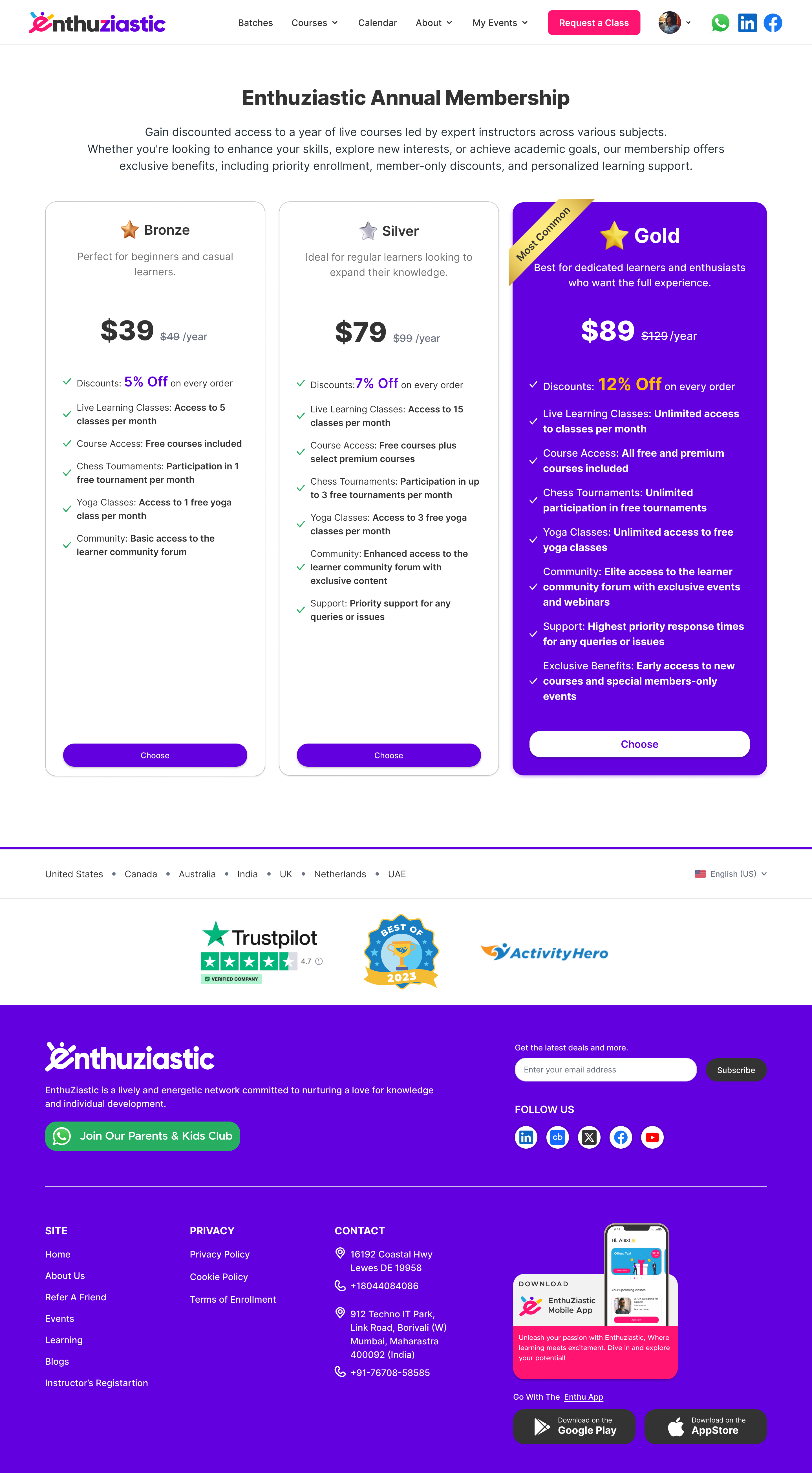
Solution
EnthuZiastic Annual Membership UI I designed a clean, conversion-focused to clearly present 3 tiered membership options:
- Bronze Plan
- Silver Plan
- Gold Plan
Final Design (Membership UI)